02
A refreshed, not replaced, blue
Trust is kept; the corporate feel is not.
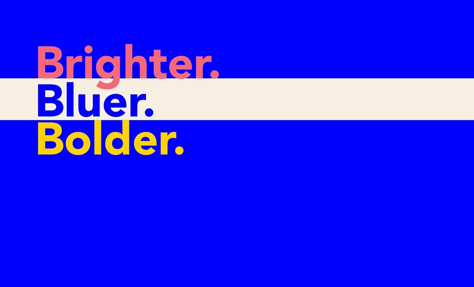
Old blue#0076BC
↓New blue#0000FF

A rebrand concept built around people.

Overview
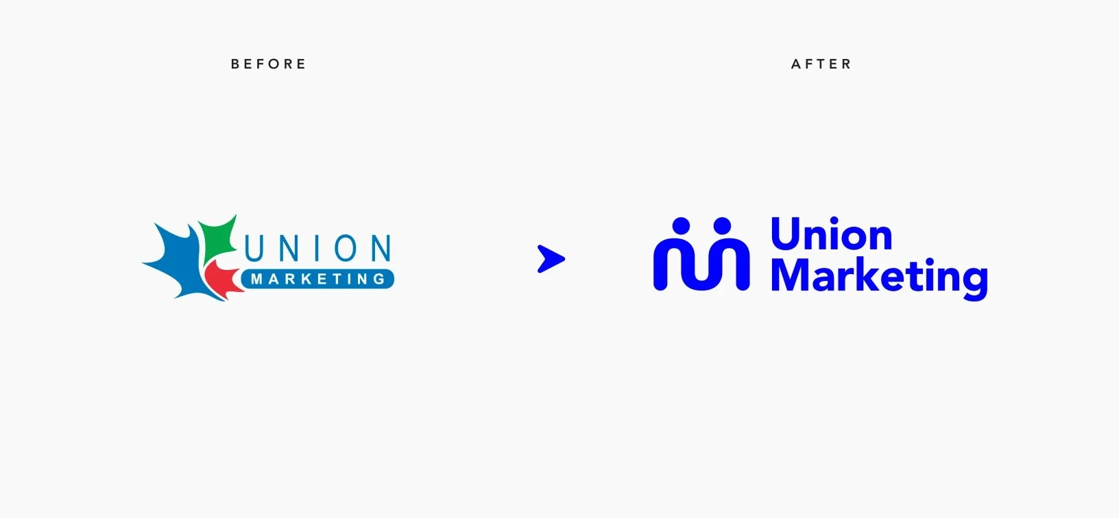
Union Marketing is a Toronto agency for unions and associations. Its maple leaf mark said national pride but did little to set the agency apart.
Before designing anything, I started with why the agency exists. Leading with purpose, not services, shaped every choice that followed.
The mission
The brand should say why Union Marketing does its work, not just what it does. Purpose is what builds trust and loyalty, and it answers the question every audience is asking: why should I care?
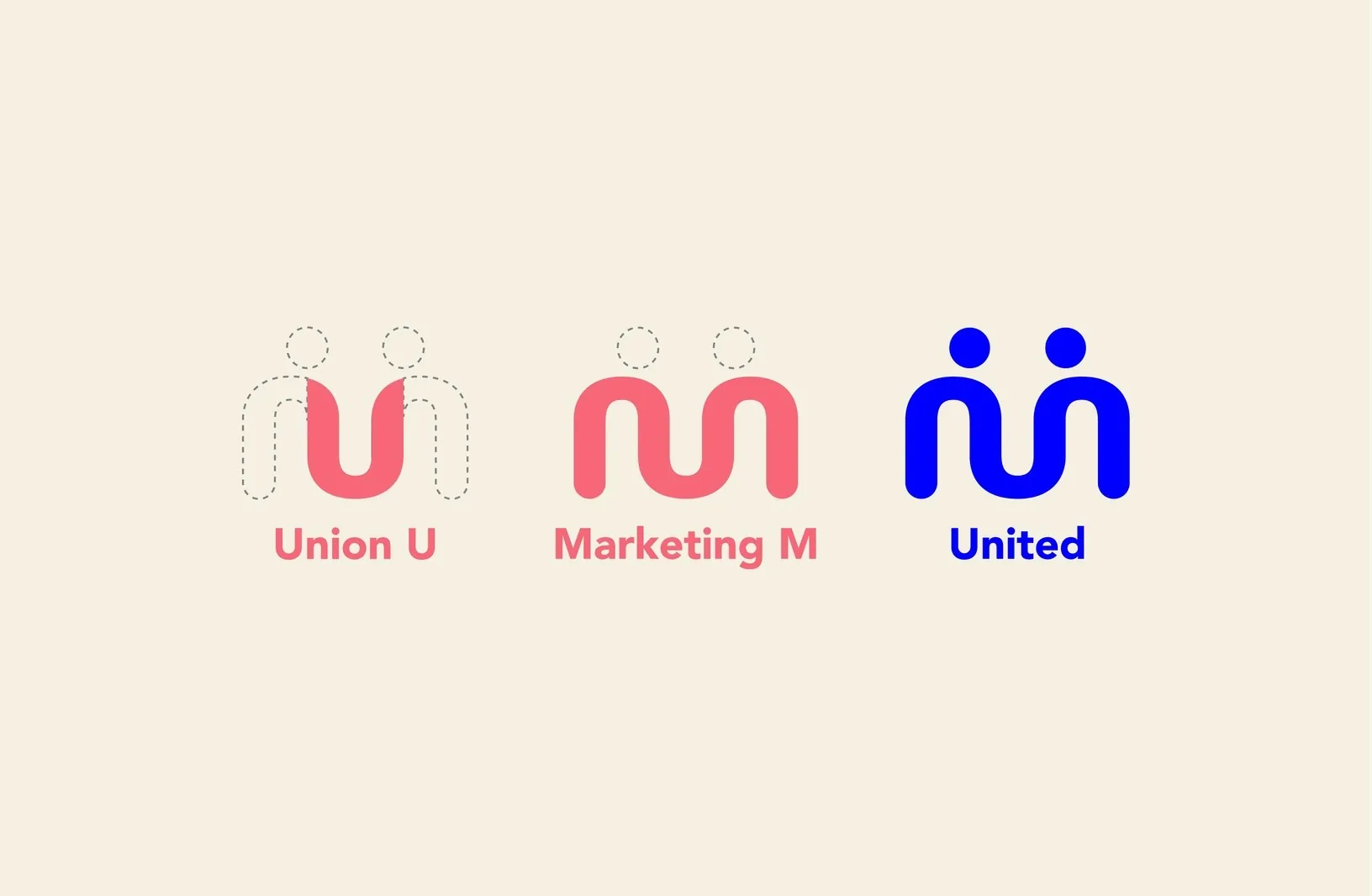
A maple leaf tells you a company is Canadian, not what it stands for. I built the new symbol from the agency’s own initials: a U and an M that become two people linking arms. It makes unity the first thing you see, and gives Union Marketing a mark no other agency could claim.
Blue stays because it signals trust and reliability. I refreshed it to a more saturated tone that reads as modern and digital-forward rather than corporate, supported by a flexible system of seven secondary colours for digital and print.
Trust is kept; the corporate feel is not.
Enough range to flex across web, print and merch.
MainPair with
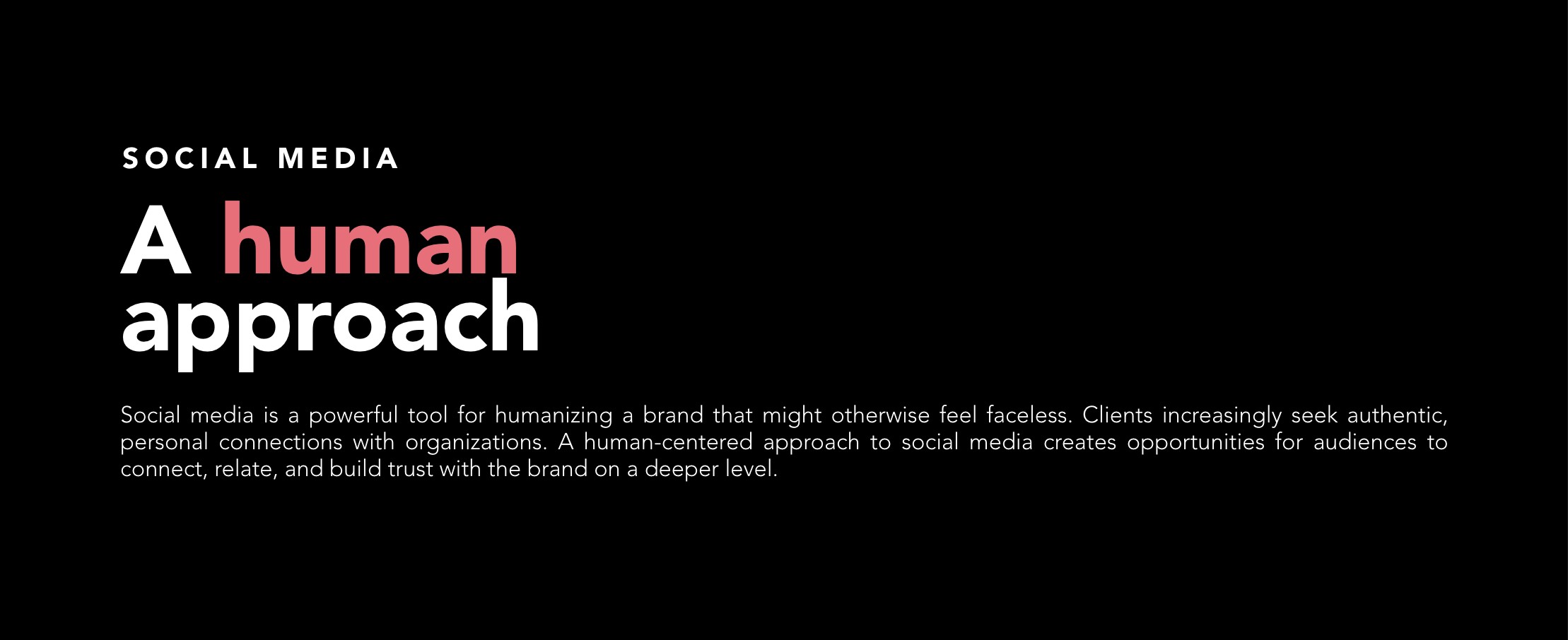
The proposal also set direction for social media: a human-centred approach that helps a brand feel less faceless and builds trust.
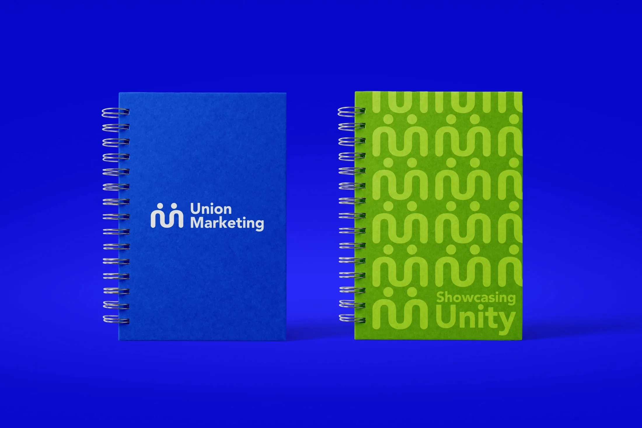
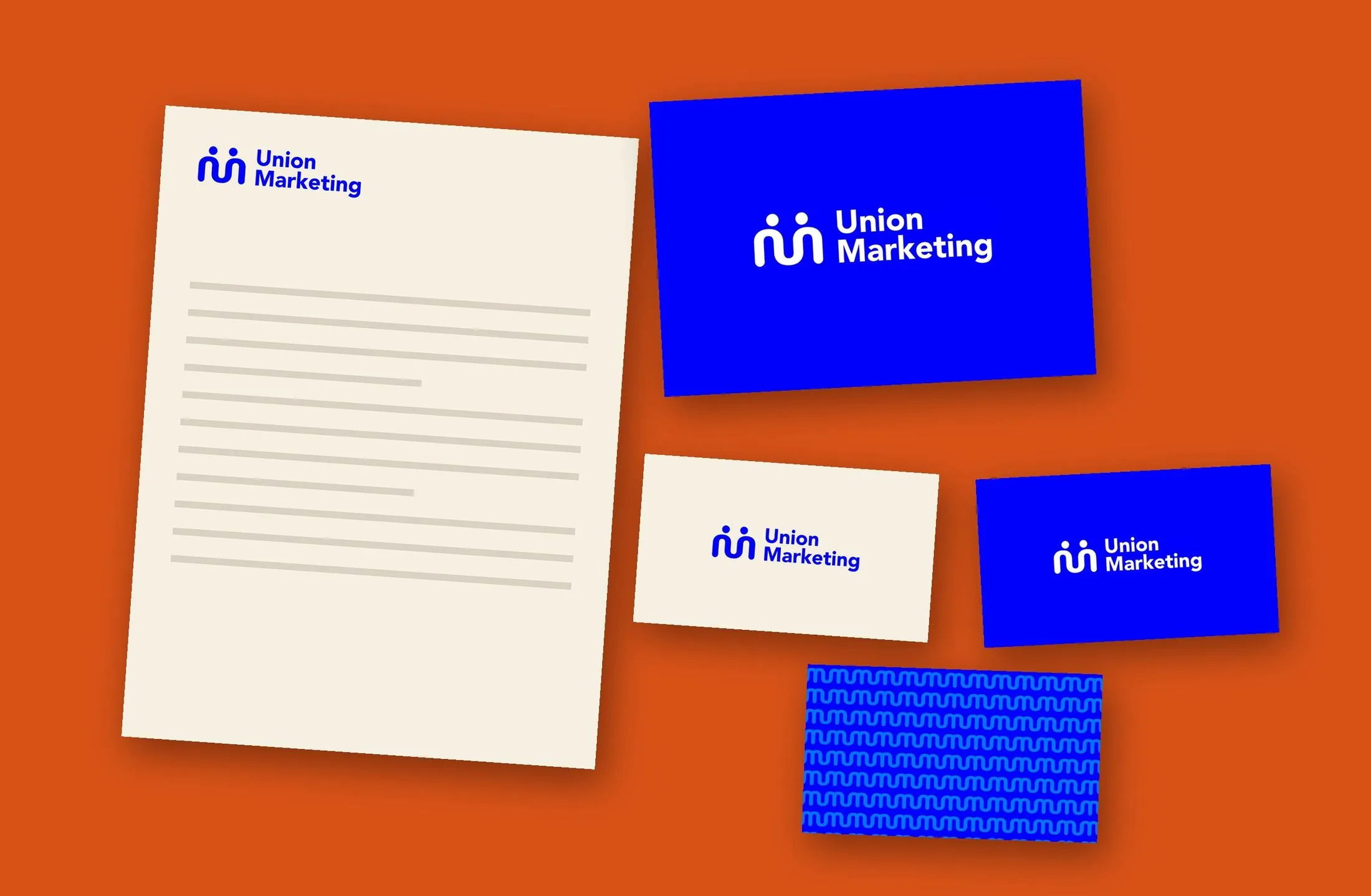
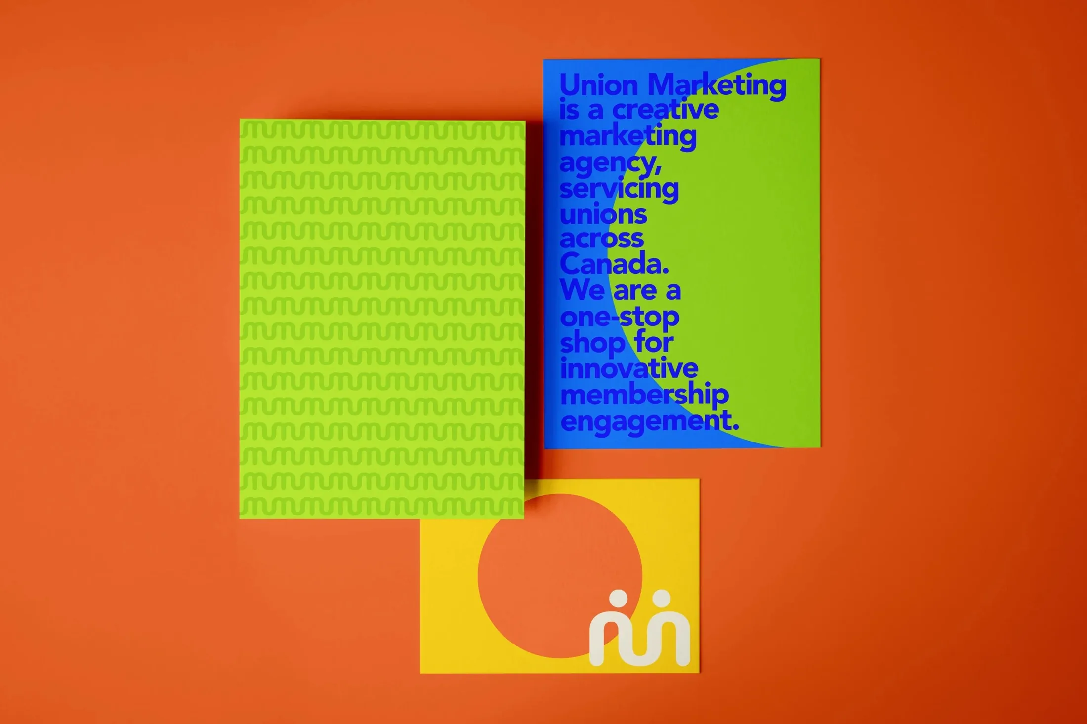
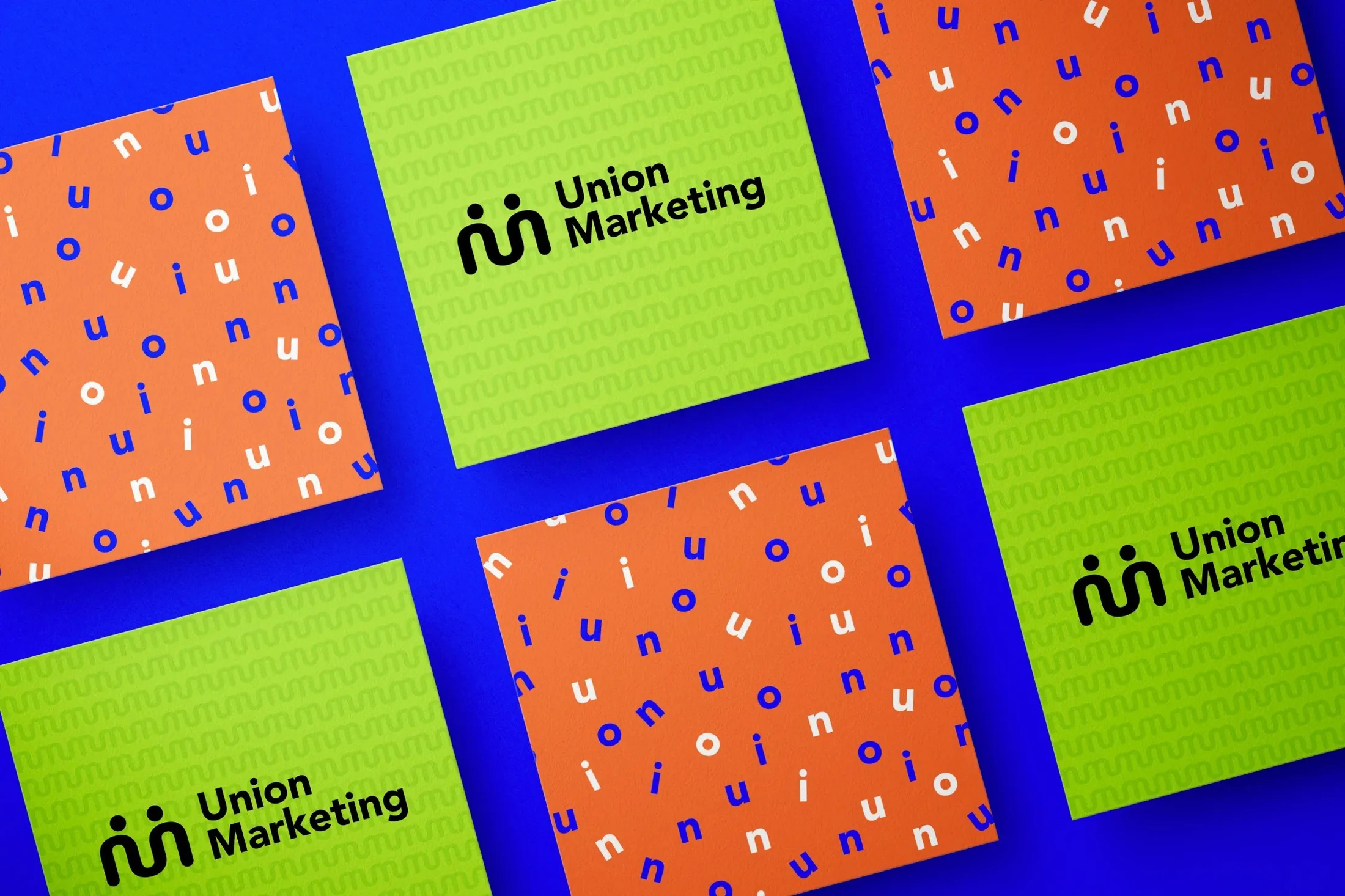
The mark, the pattern built from it and bold colour blocking flex across notebooks, stationery and cards, so every piece reads as the same brand.
The internship deepened my understanding of design systems, strengthened my ability to work within brand constraints, and gave me hands-on practice translating strategic goals into visuals.