
Heads Up
Getting a generation to look up.
- Organization
- The Dais at TMU (In-house designer), with Rogers
- Role
- Lead designer and illustrator, then design direction
- Scope
- Identity, illustration, web, interactive policy map, print, merch
- Design outcome
- The face of a campaign that helped bring phone restrictions to 10 provinces
Overview
Heads Up is a Canada-wide Dais initiative helping schools and students rethink phone use during the school day. It launched as Screen Break, now the name of Rogers’ national program, which the Dais partners on. URL to IRL is its national youth event.
I took it from an idea to a full brand: identity, illustration, web, events, print and merch. As partners and developers joined, I moved into design direction.
The challenge
A conversation about phones in classrooms involves audiences with different needs: educators and policymakers who need clear evidence, and students who will only engage if the program speaks to them on their terms. The design had to earn trust with the first group without losing the second.
A custom illustration style
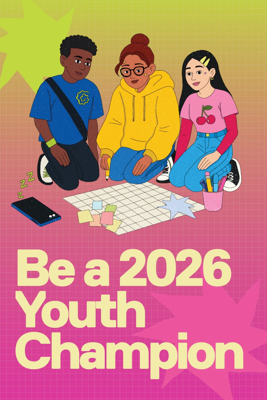
I created the illustration style for Heads Up, and it shows up in everything the campaign makes. I was inspired by ’90s and early 2000s shows about kids at school, like Arthur and The Magic School Bus, and wanted to bring that feeling back for a new generation of students. My first draft was close, but the characters felt too generic, so I kept going until they had their own personality.
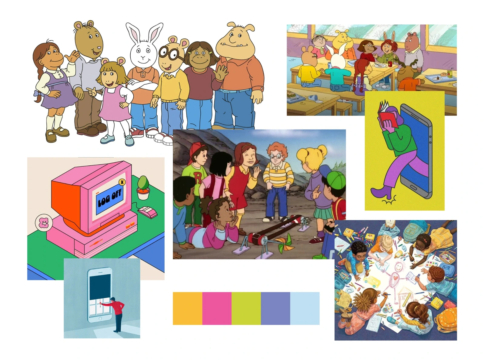
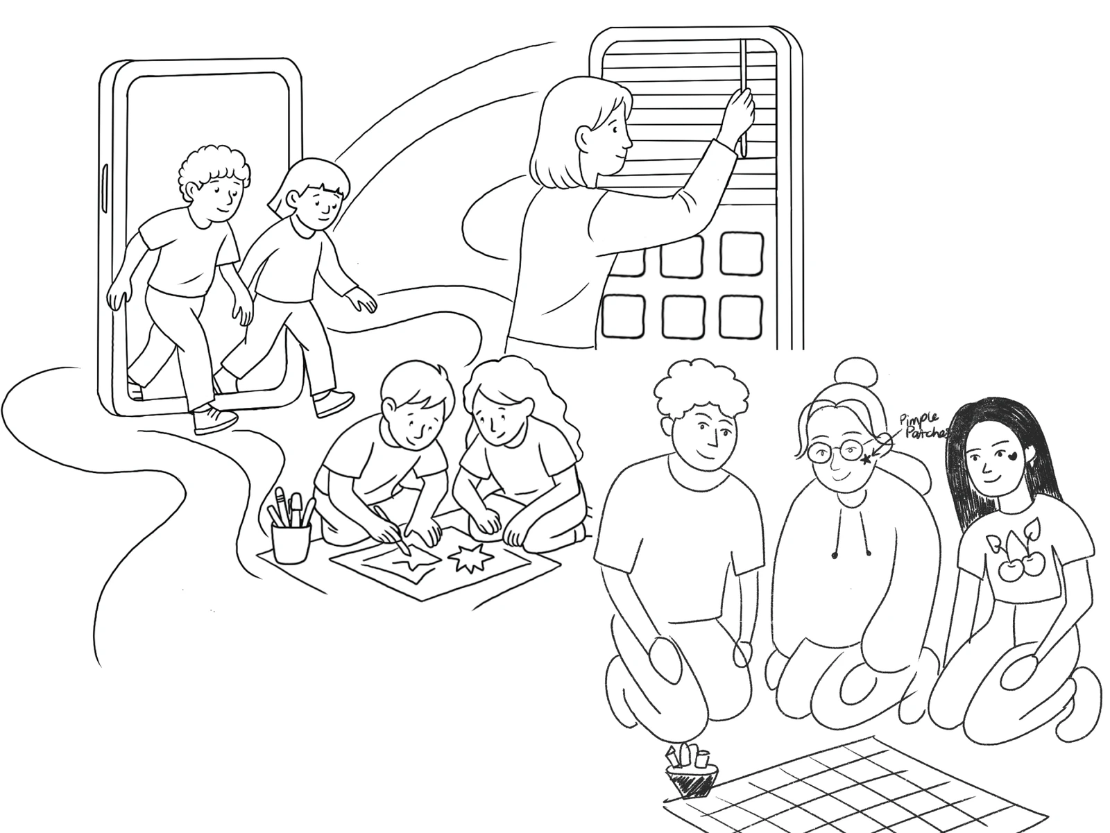
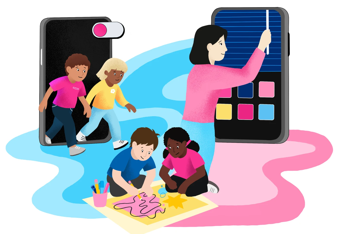
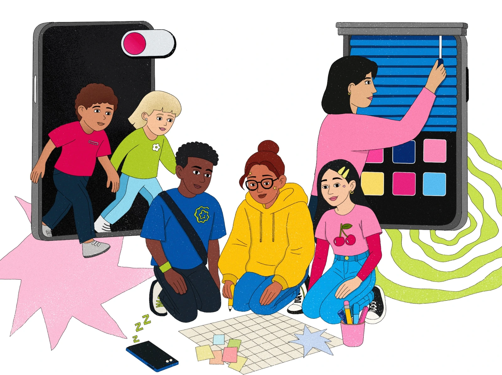
01 MoodboardReferences: Arthur (PBS Kids), The Magic School Bus (Scholastic) and editorial illustration
02 Rough sketches and early compositions
03 First draft: characters without personalityI wasn’t happy with this pass: smooth vector fills and simple faces made the kids look like stock art. So I reworked the style, adding grain, hand-drawn line detail and personal touches like hair clips, star pimple patches and graphic tees.
04 Final: a custom art style made for Heads Up
Colour
Dais brand
Added for illustration
Characters
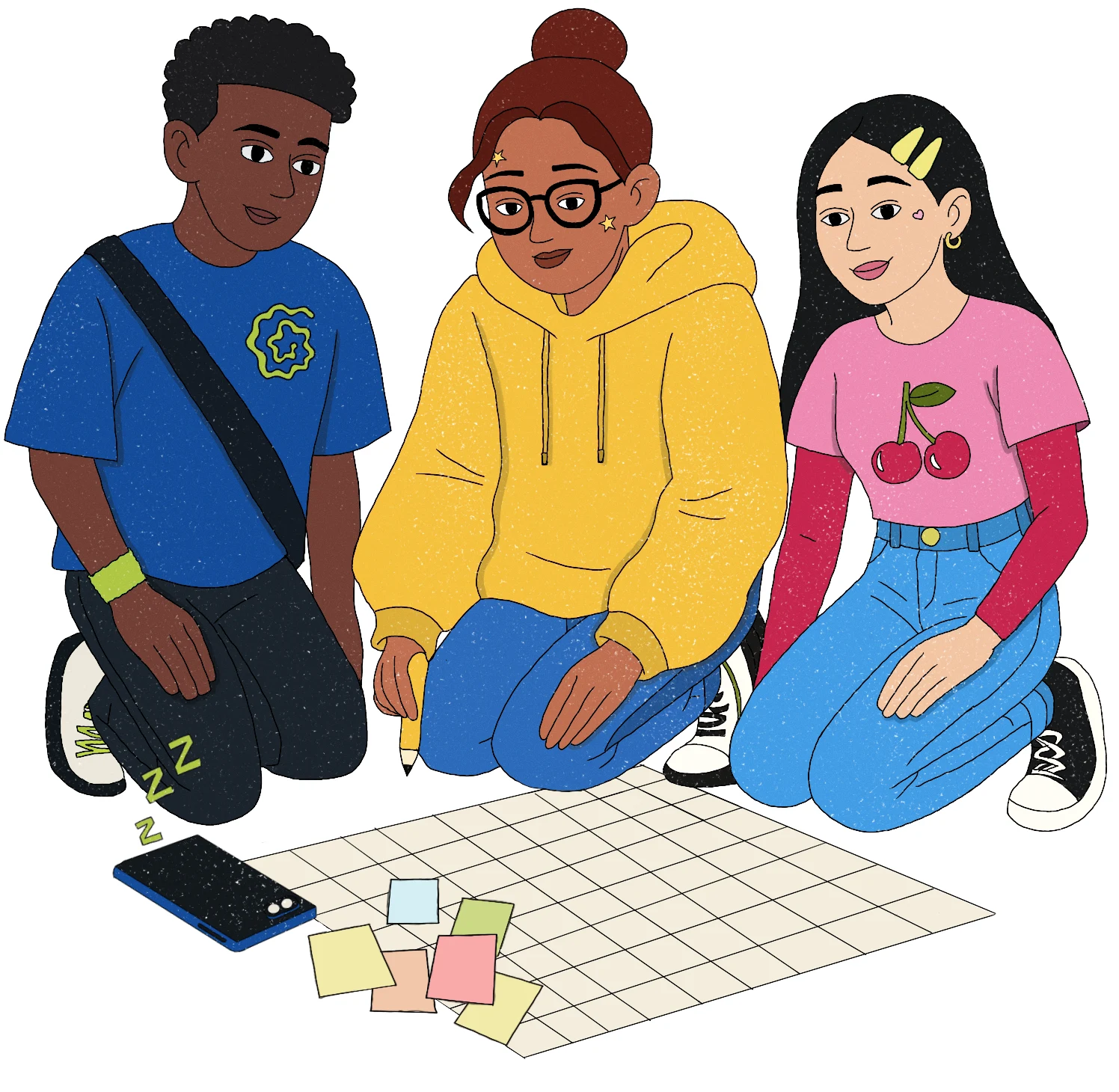
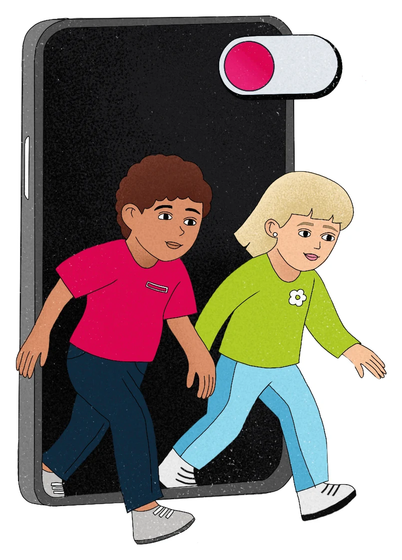

Settings and objects
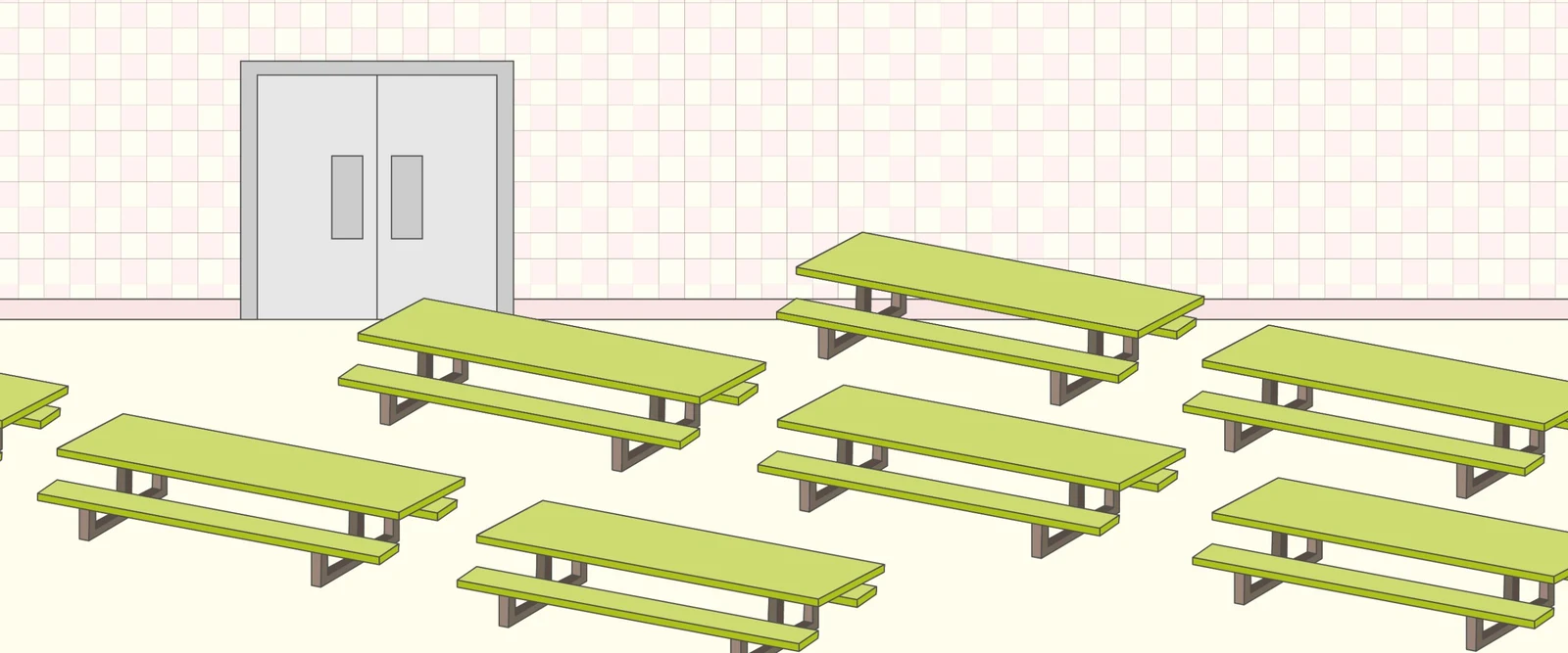
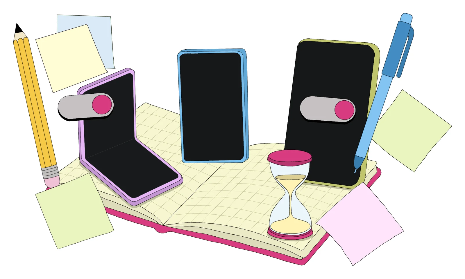
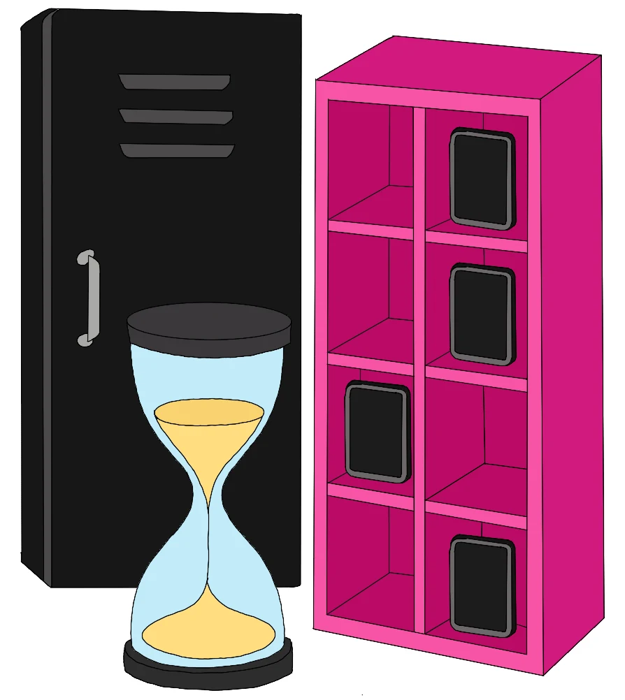
The Heads Up brand
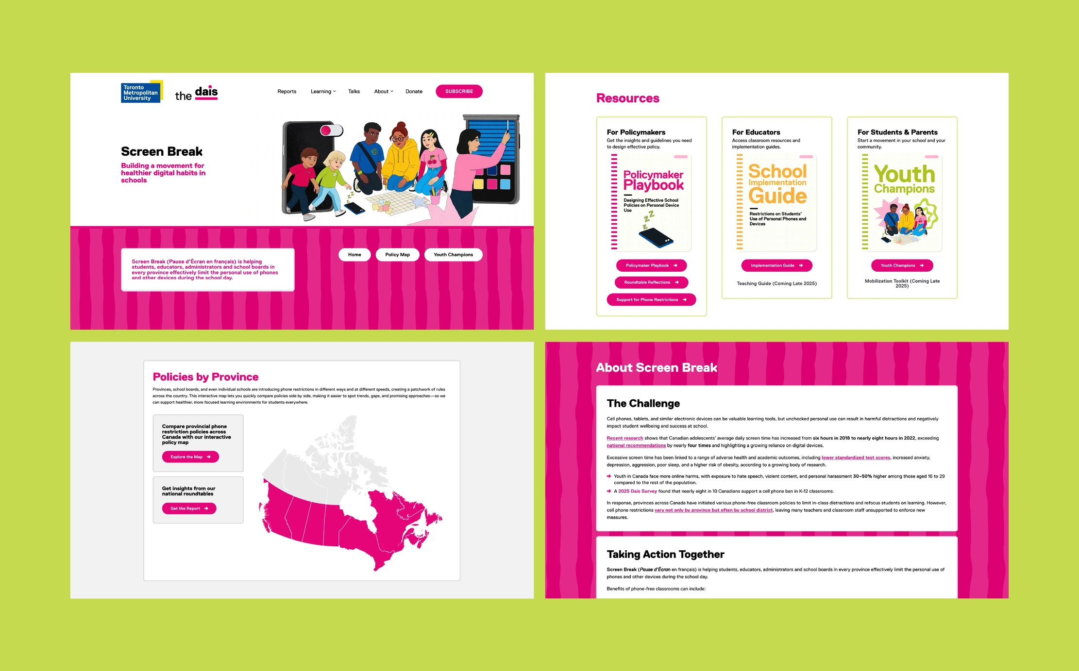
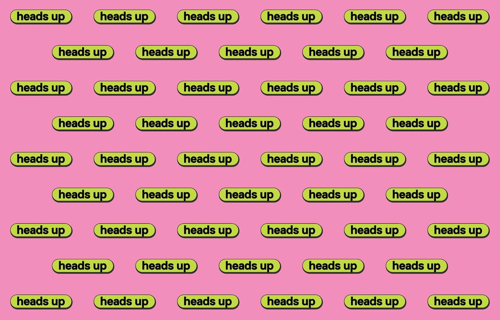
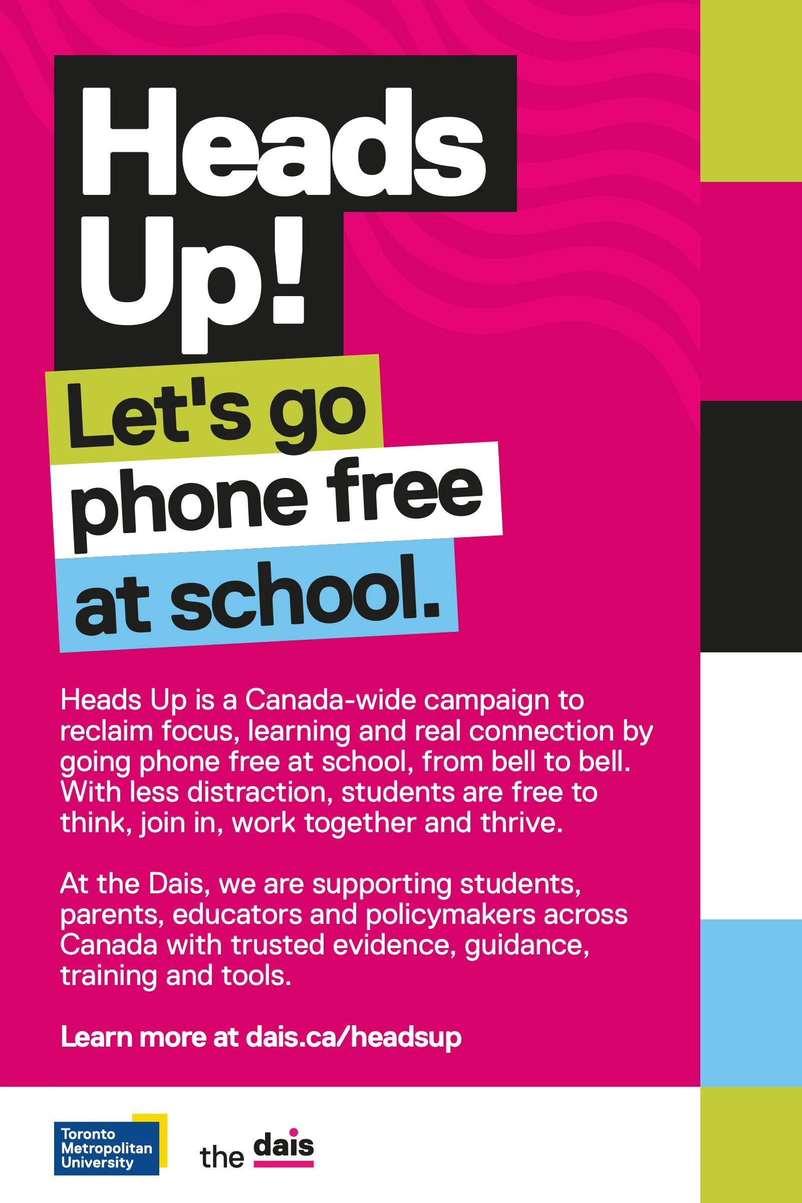
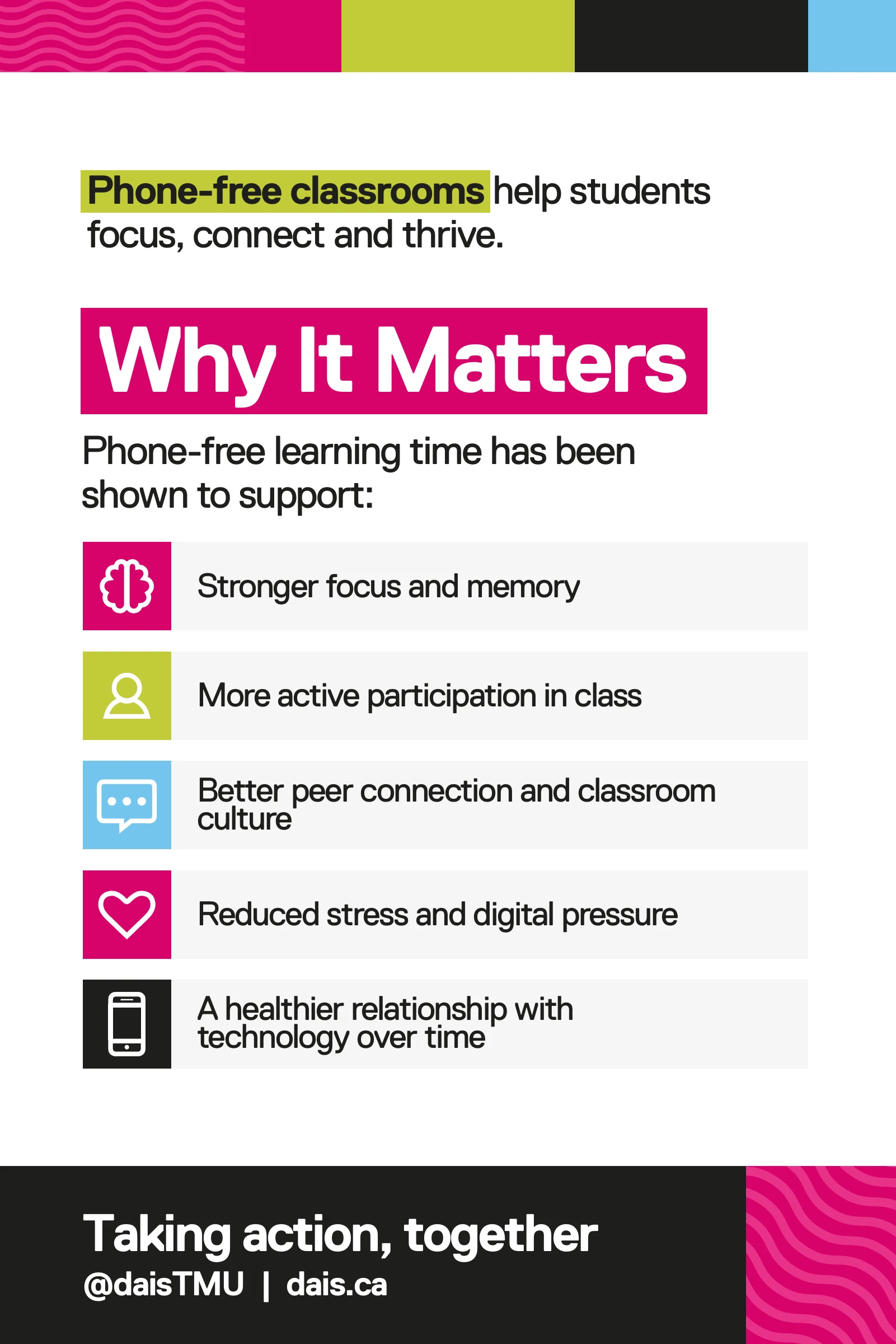
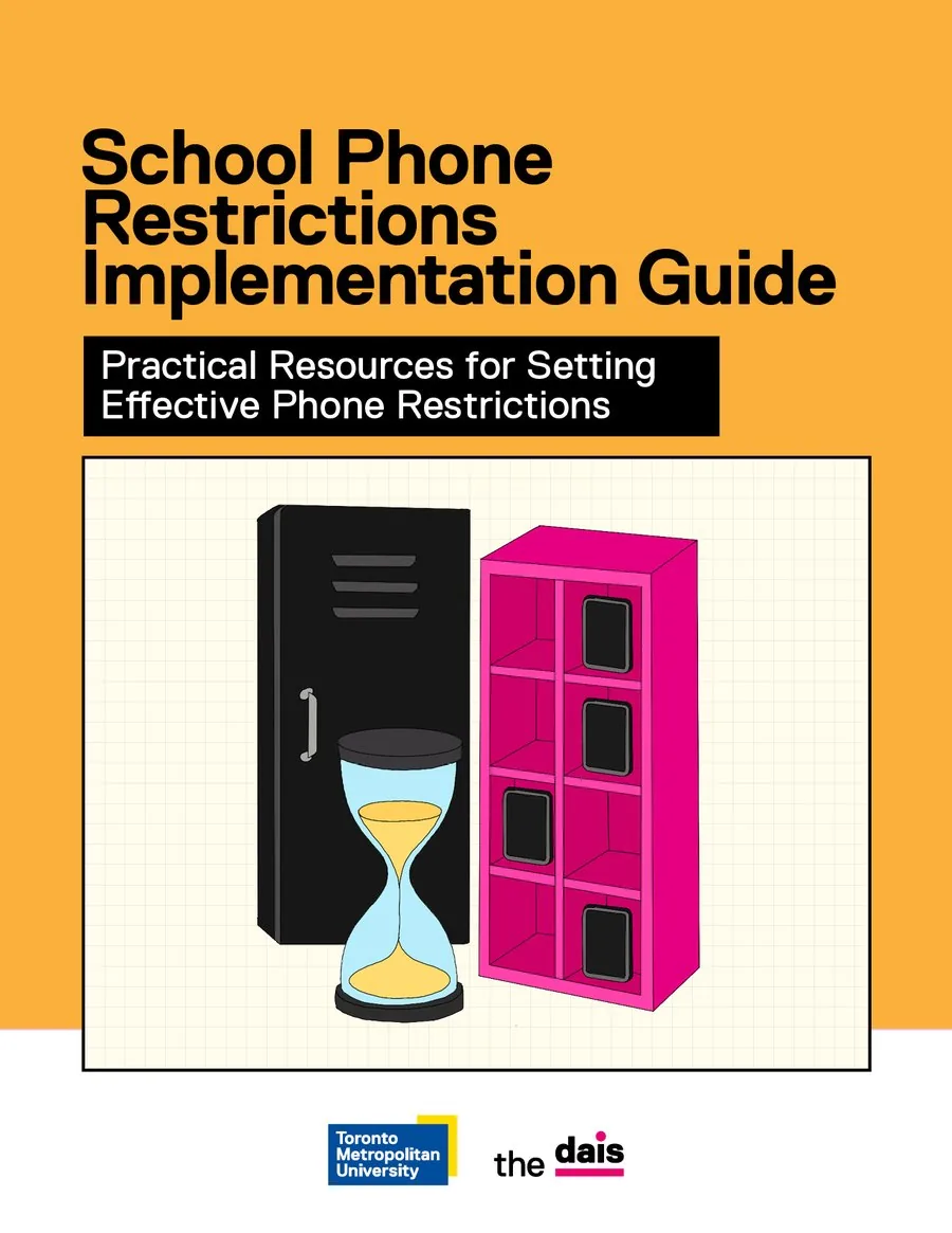
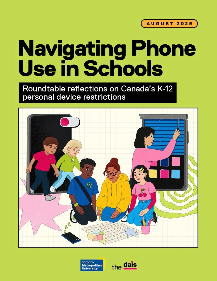
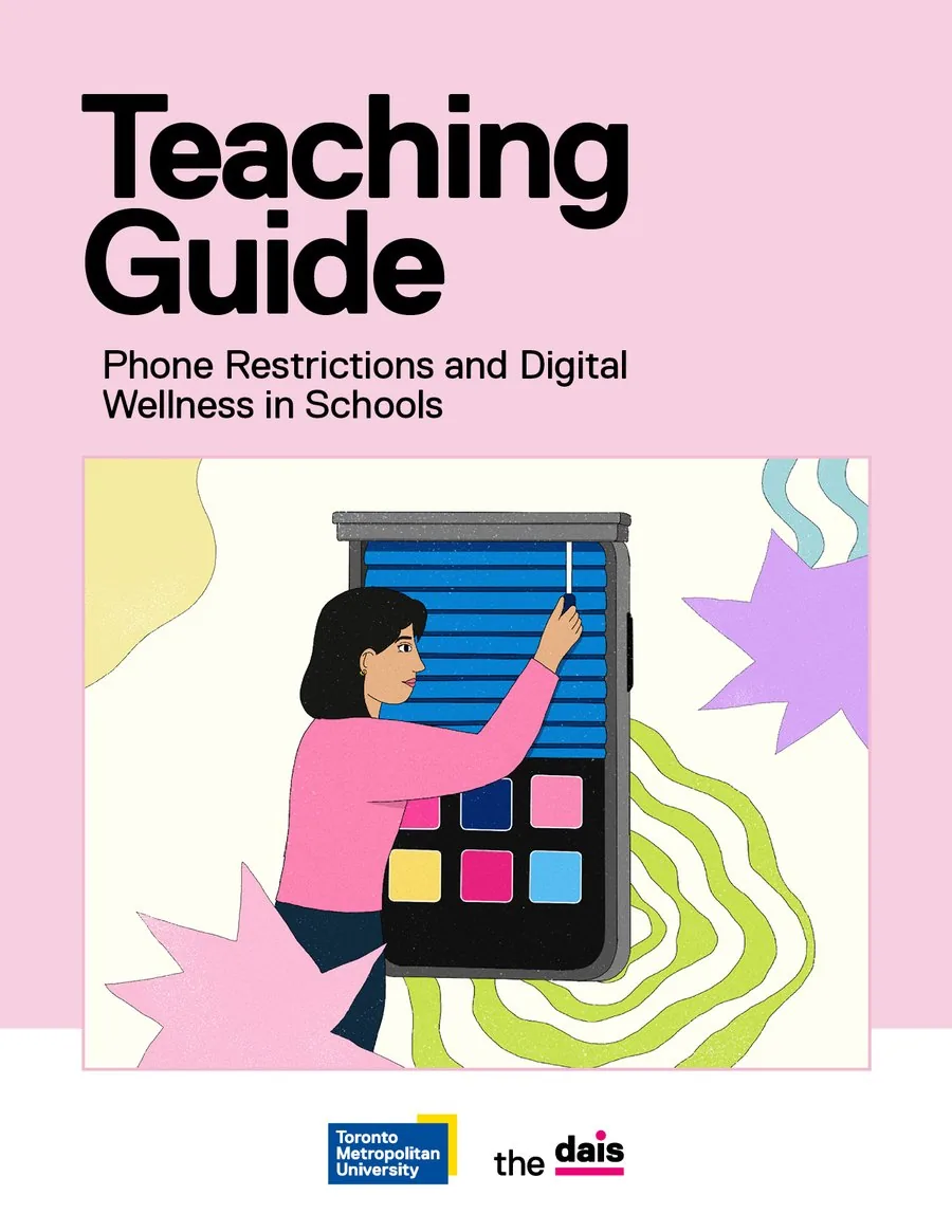
I built one identity that could speak to everyone, then tuned it for each audience. Sticker-style type, colour and the characters carry the campaign. For policy audiences, the same system steps back into clear hierarchy so the message stays readable.
03.1
For educators and policymakers
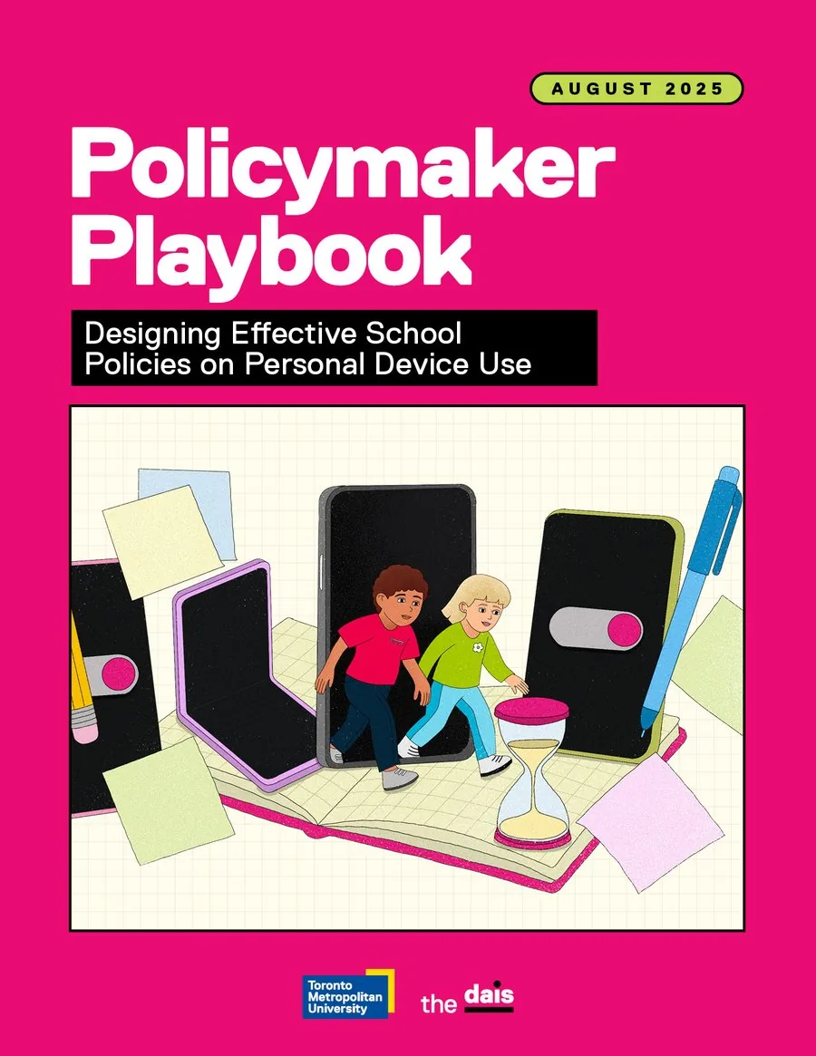
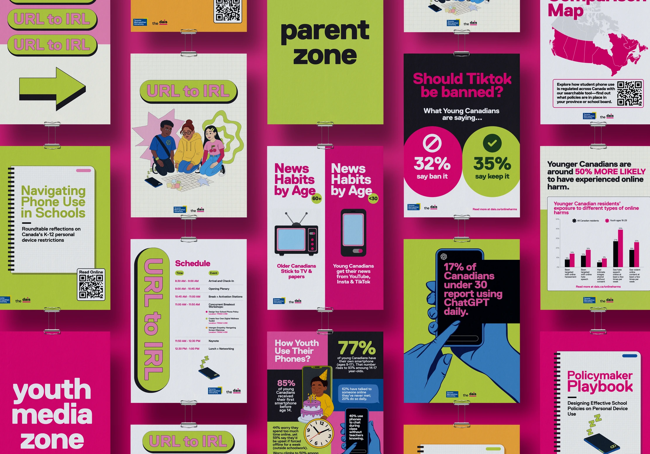
I designed four guides and playbooks and the interactive policy comparison map, which sets phone restriction policies across Canada side by side, so a parent, teacher or journalist can understand them at a glance.
03.2
For students: URL to IRL
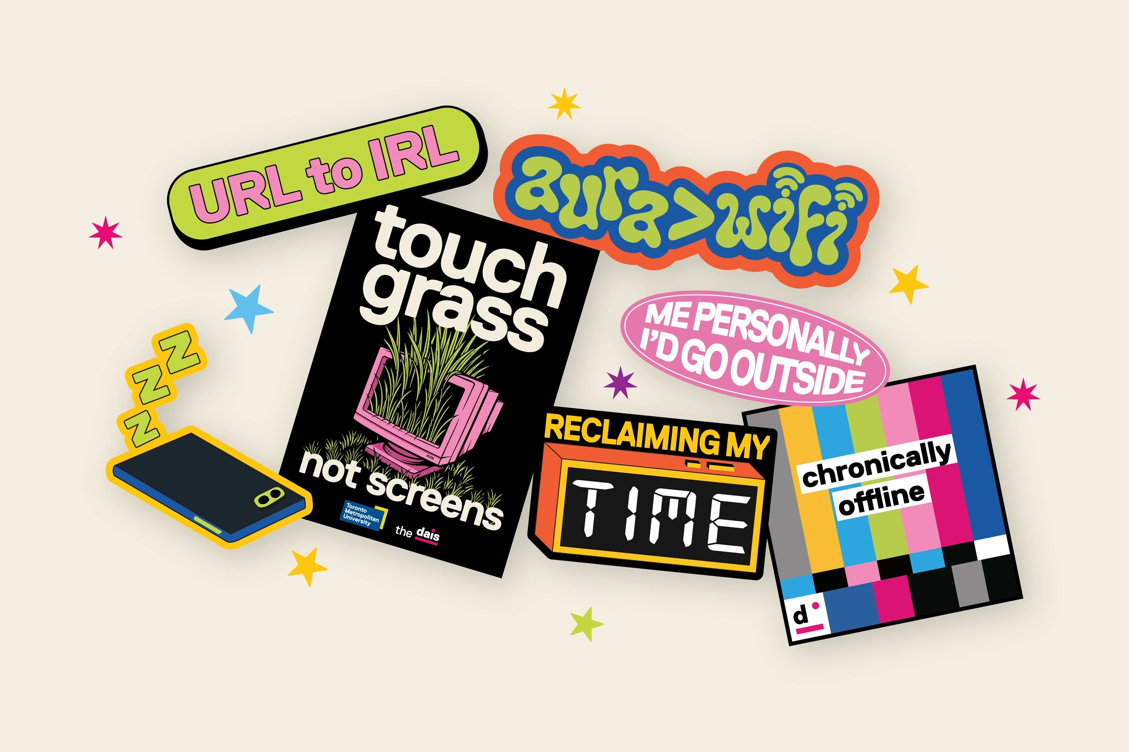
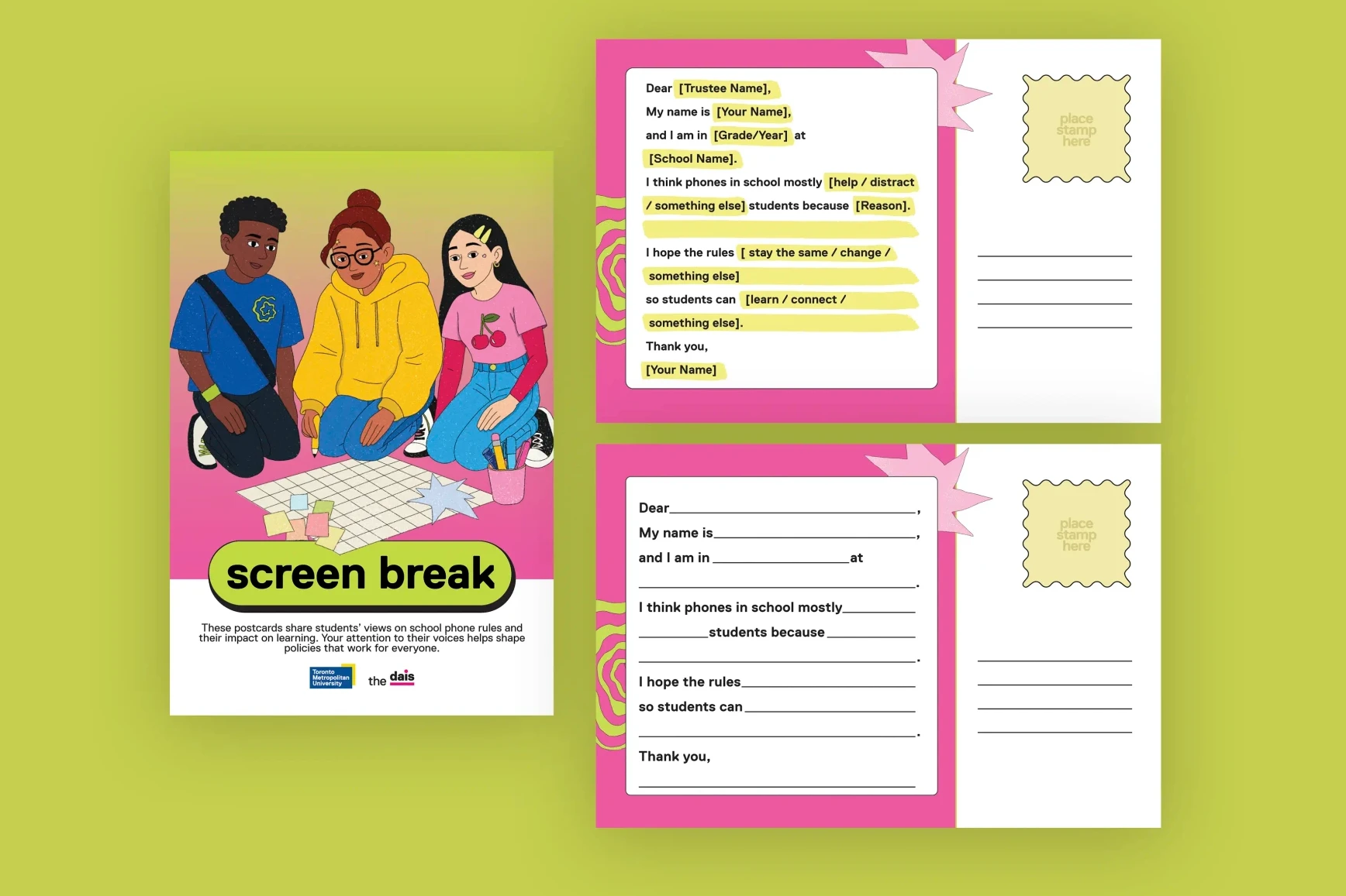
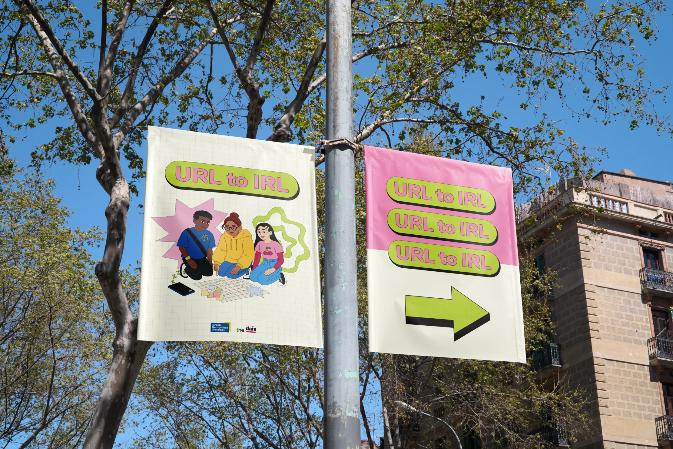
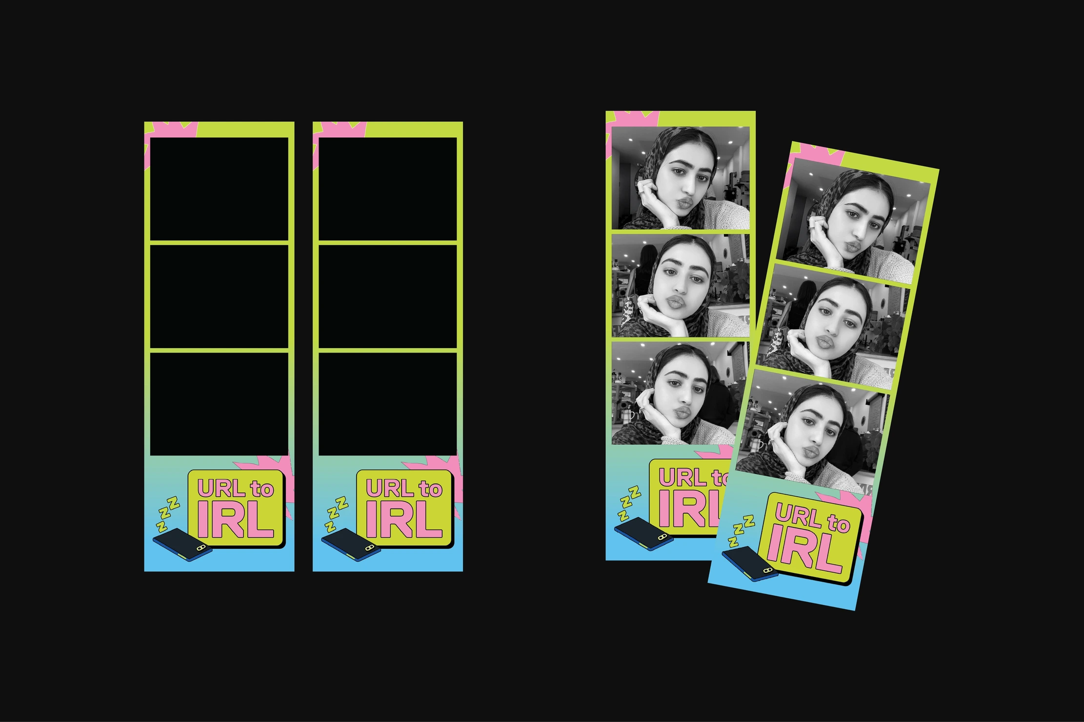
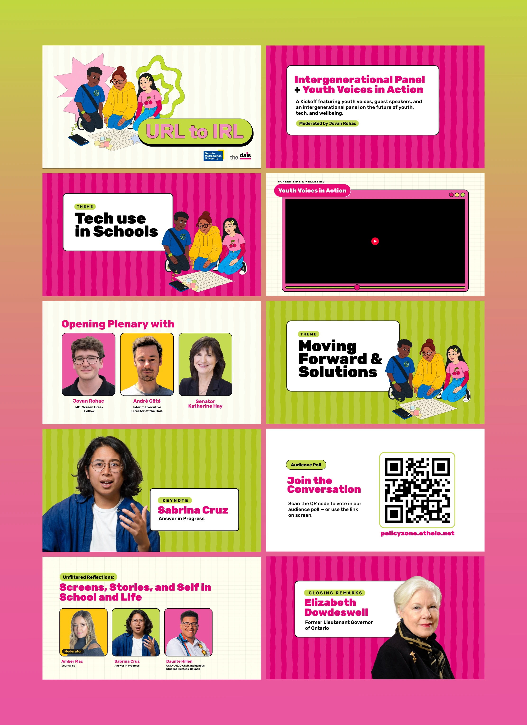
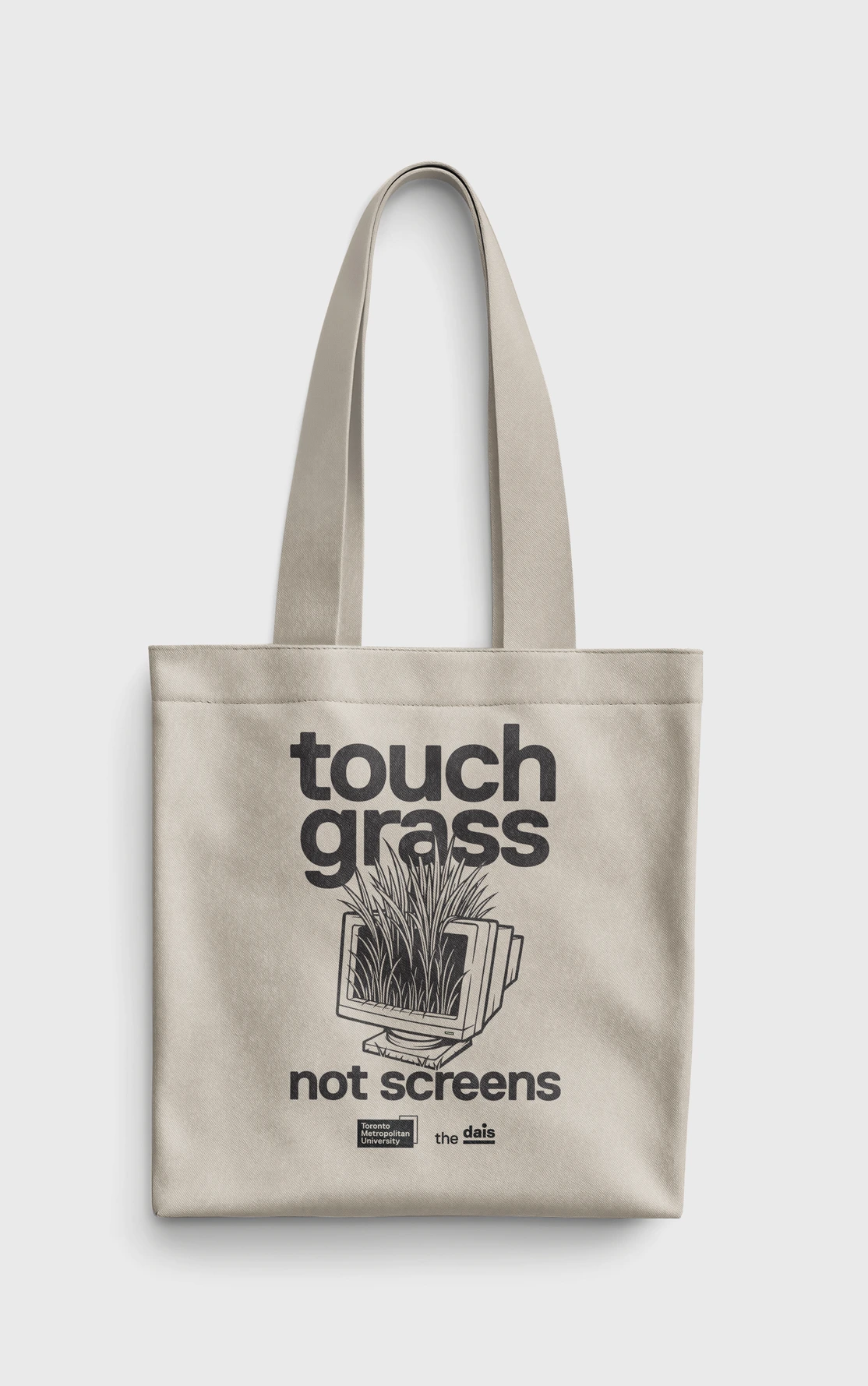
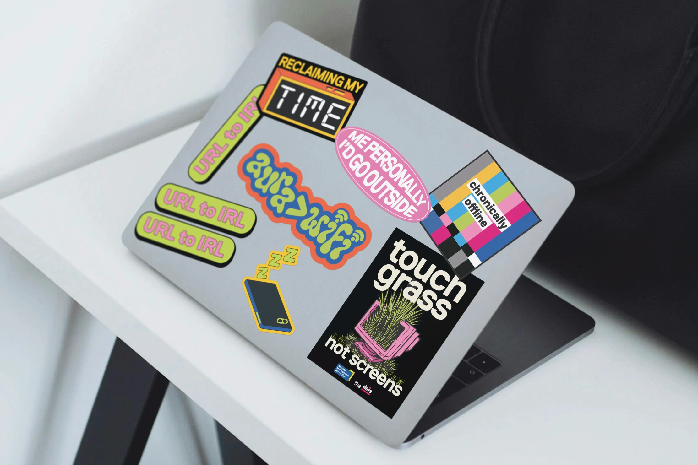
URL to IRL is the Dais’s annual youth-led event on phone-free schools. I designed its identity, from street banners and slides to stickers, merch and postcards, so the room feels like it belongs to students.


What the work supported
These are the program’s results, which the identity and tools helped carry. Source: Dais Impact Report 2023–26.