Generation Climate
Urgency you can see.
- Client
- Generation Climate, funded by the Government of Canada
- Role
- Lead designer; art direction on the logo by TMU Marketing & Creative Services
- Scope
- Identity, colour system, social, posters, training materials, decks, website
- Design outcome
- A national brand that carried nearly 270,000 youth climate conversations
Overview
Generation Climate works to counter climate misinformation and equip young people in rural and suburban communities through conversations, online training and local climate action.
The challenge
Generation Climate set out to counter climate misinformation among young people across Canada. Its brand had to cut through crowded feeds, make the urgency of climate change felt at a glance, work equally in English and French, and give a university-backed initiative an identity young people would see as their own.
The process
I inherited a first-round identity from TMU and, as lead designer, created a new one rooted in climate itself.

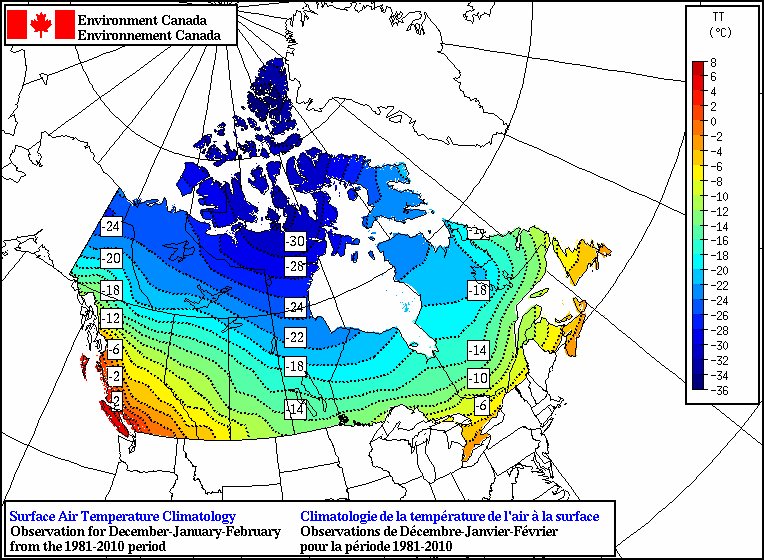
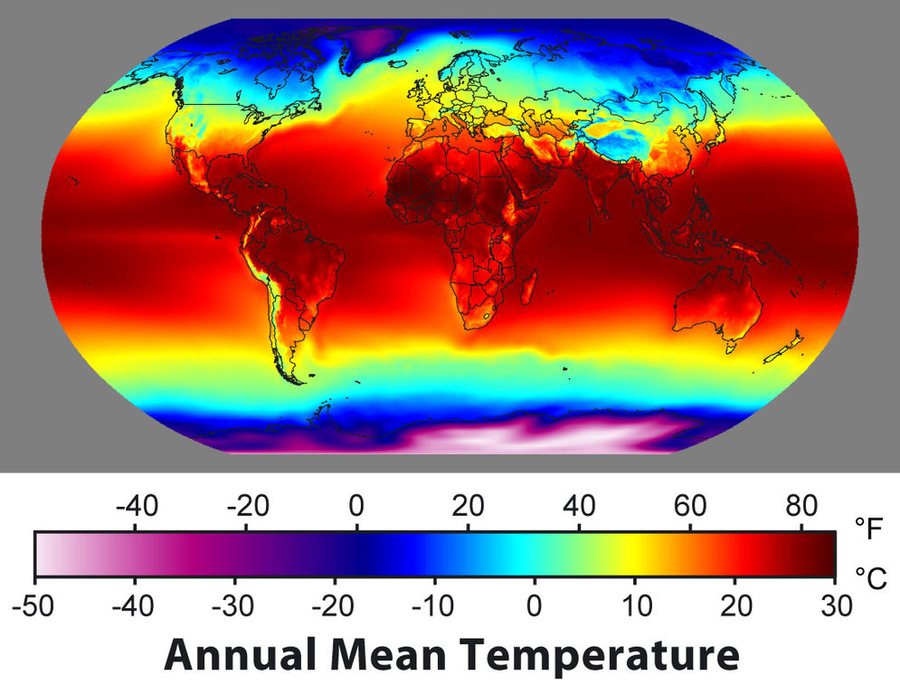
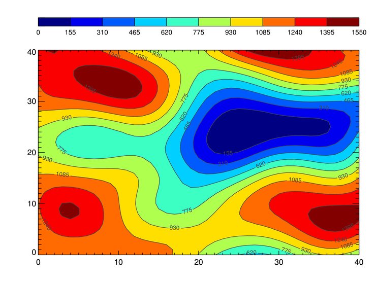
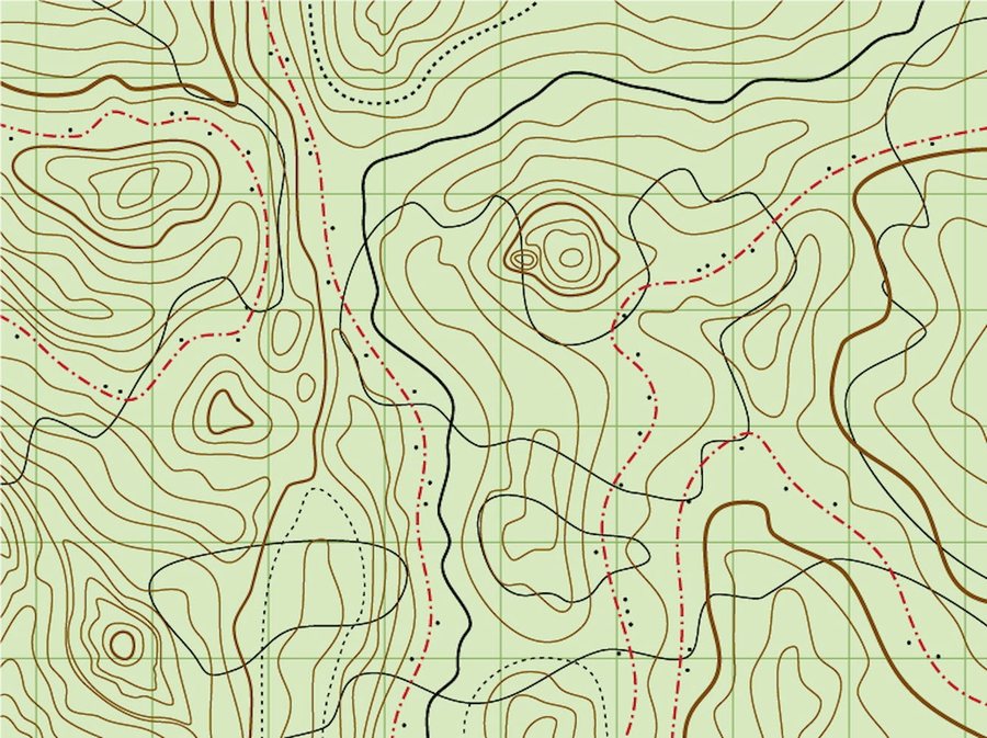
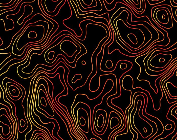
References: Environment Canada climatology map and other published temperature and topographic maps

The new Generation Climate system
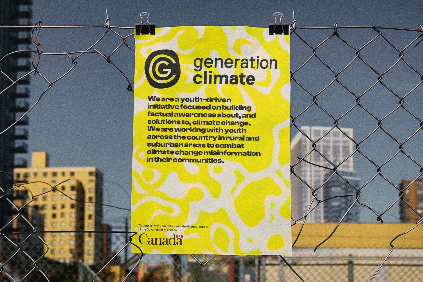
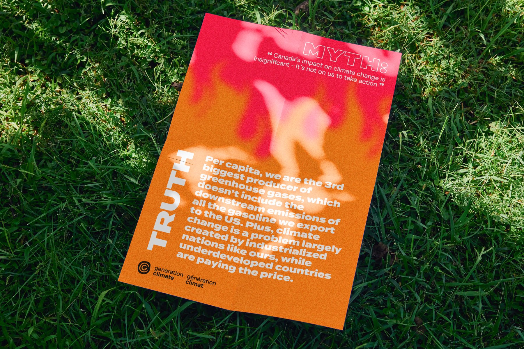
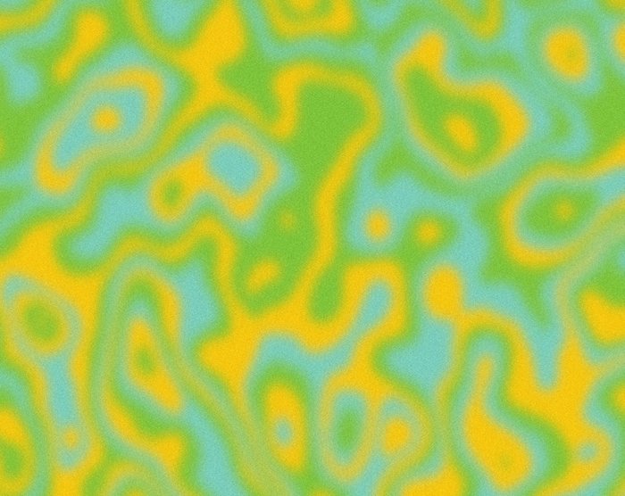
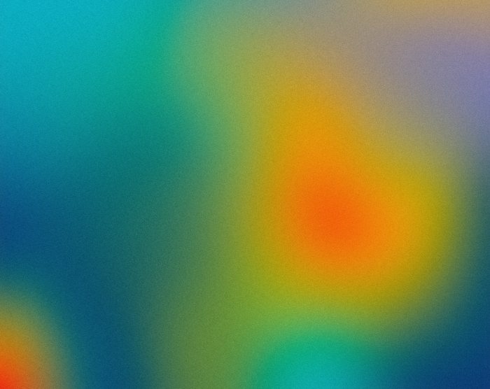
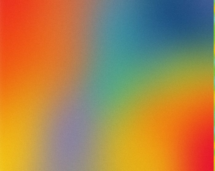
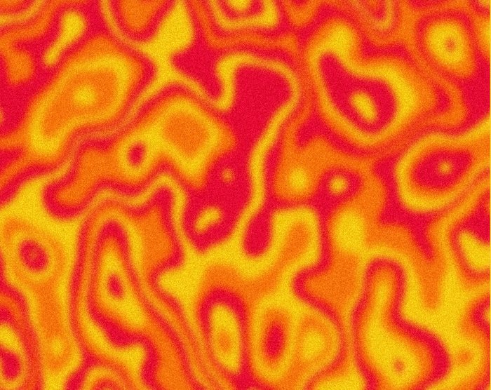
Heat maps became the identity. Bold, saturated colour fields carry the sense of rising temperature and the need to act now. As lead designer, I developed the complete visual identity and website, and oversaw the logo, provided by TMU Marketing & Creative Services, giving design feedback to keep the mark consistent with the brand. The bilingual English and French wordmark sits on the heat-map gradients, so the identity works across Canada from the first touchpoint.
A neutral grey and seven colours ordered like a temperature scale, each paired with black or white text and checked for contrast. The colours blend into grainy gradients and heat-map fields that sit behind posters, posts, slides and the website. This shared colour system lets each piece look different while staying unmistakably one brand.
English and French sit side by side from the start. Early explorations put the mark in every palette colour; the final system uses only black and white. With the gradients and heat maps carrying the colour, a one-colour mark stays legible on any background and never competes with the artwork behind it.
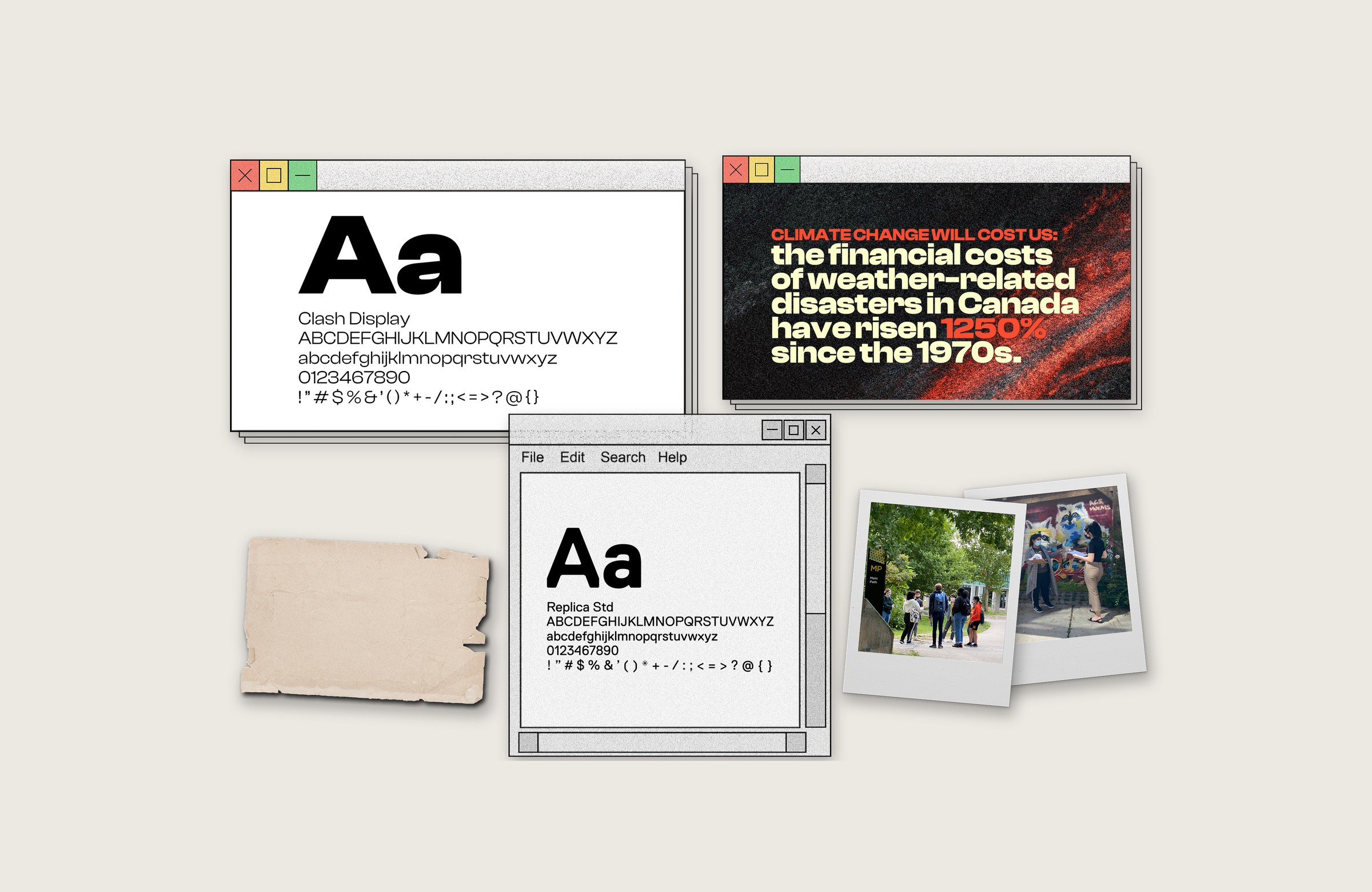
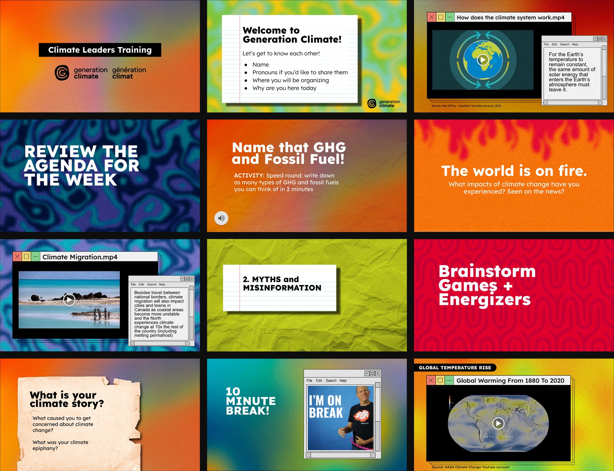
Clash Display for big, direct headlines. Replica for body copy. Retro computer windows, polaroids and paper hold photos, video, quotes and activities.
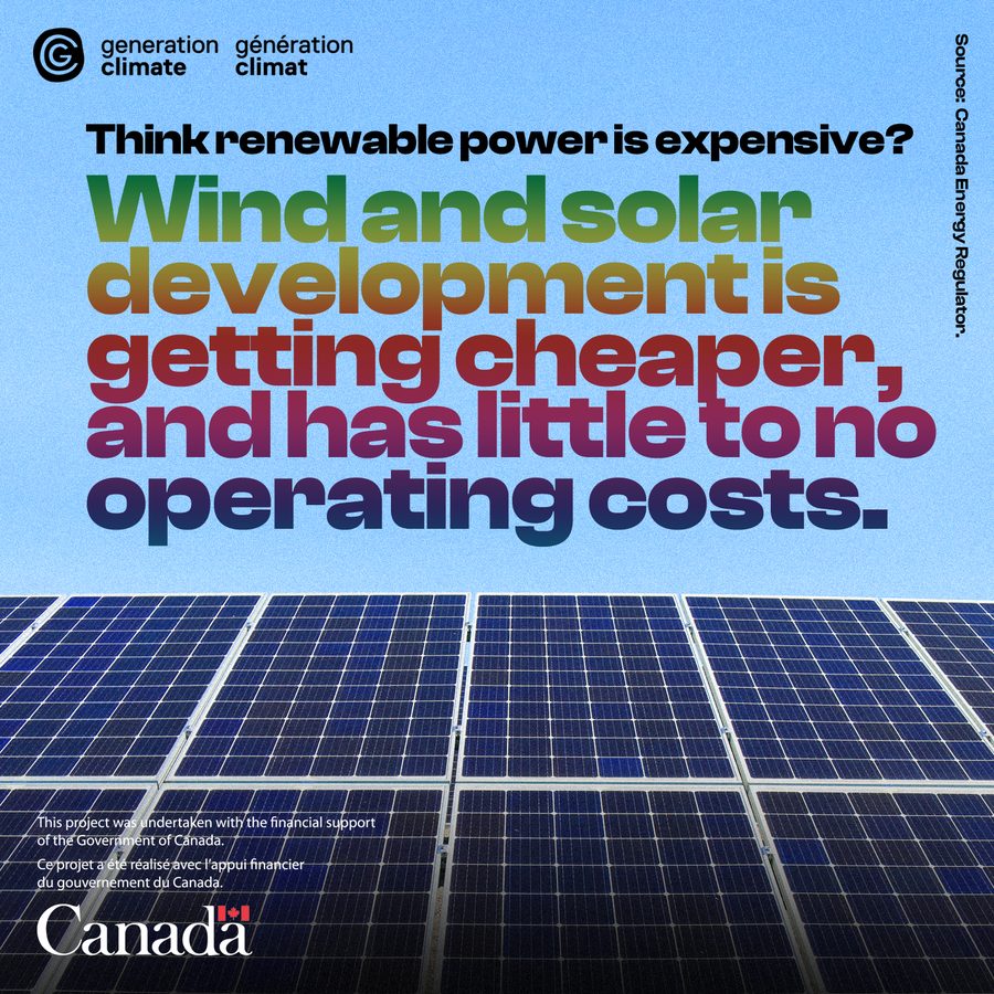
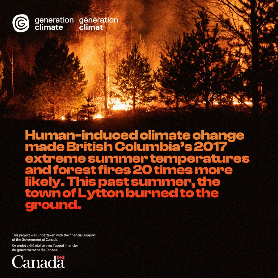
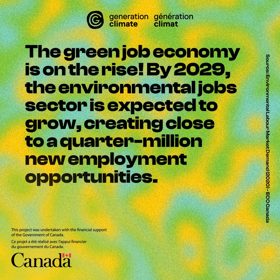
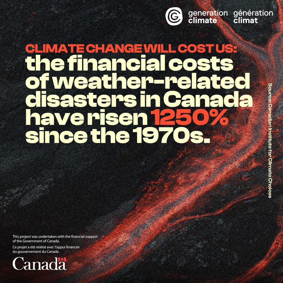
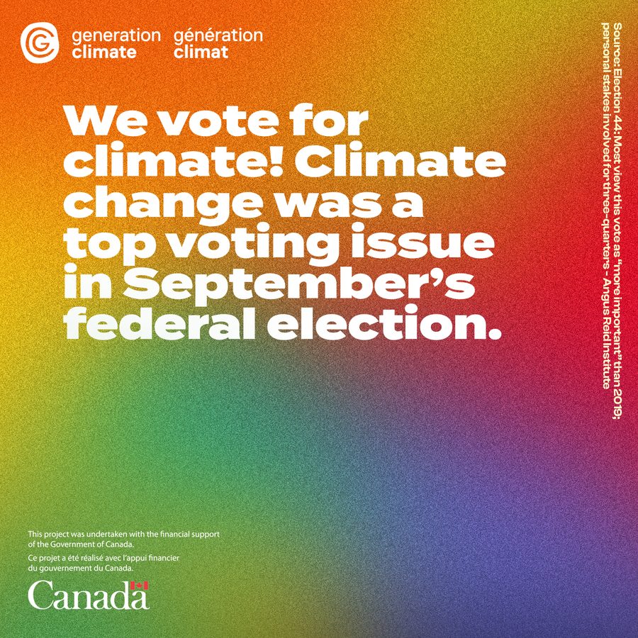
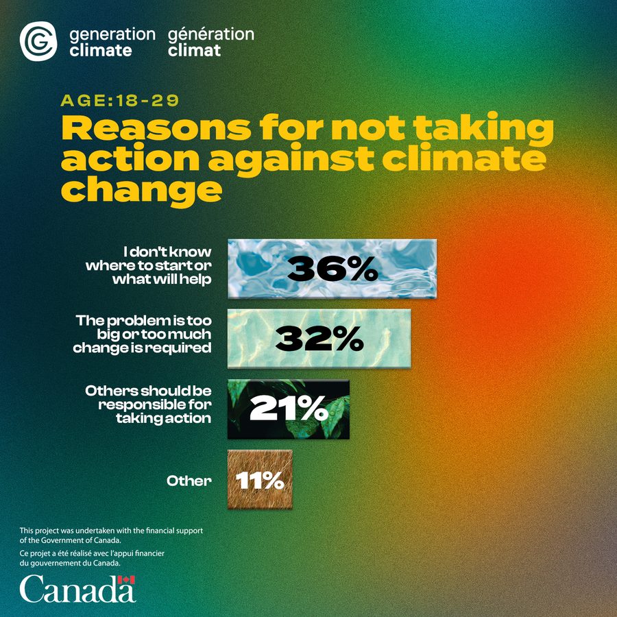
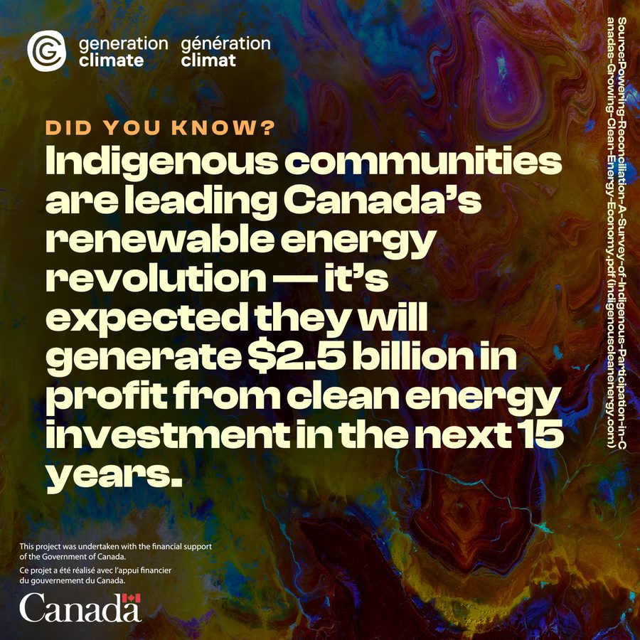
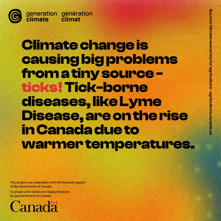
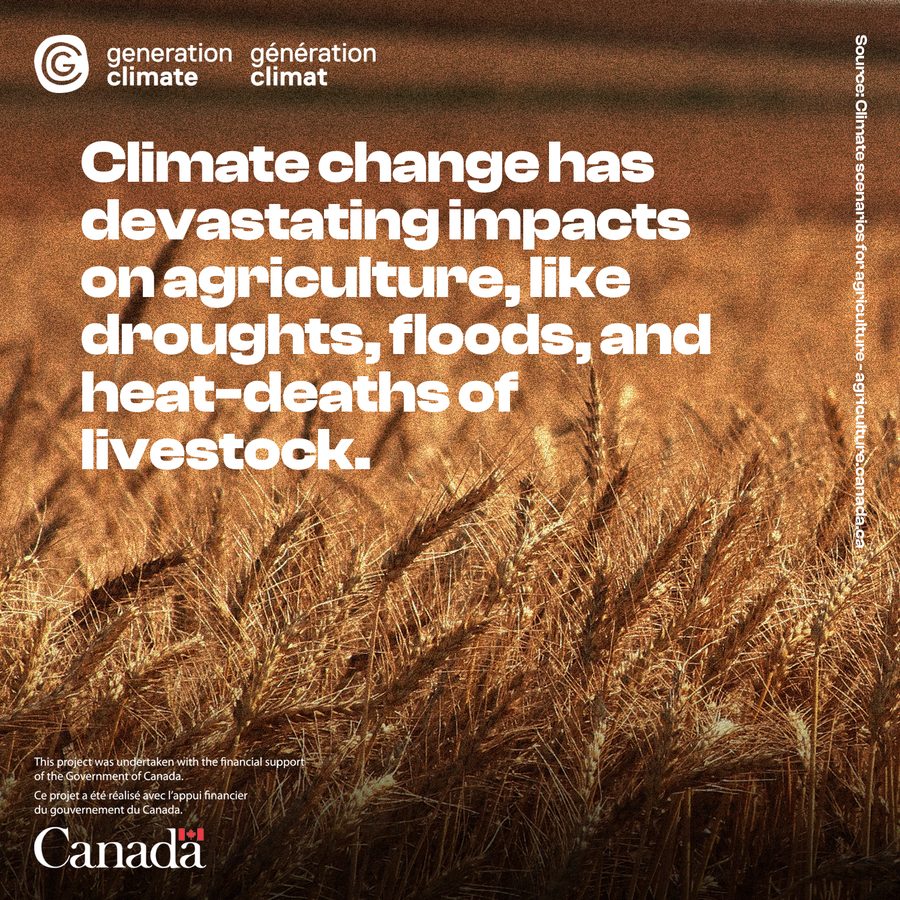
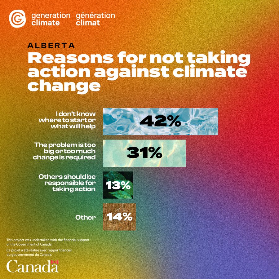
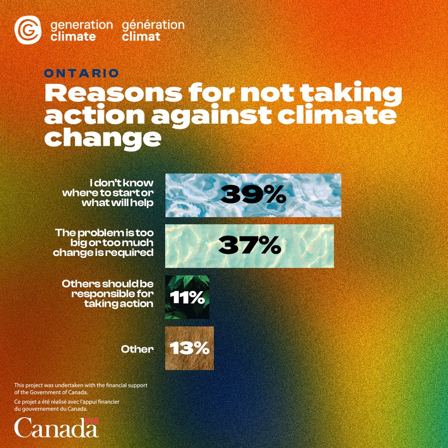
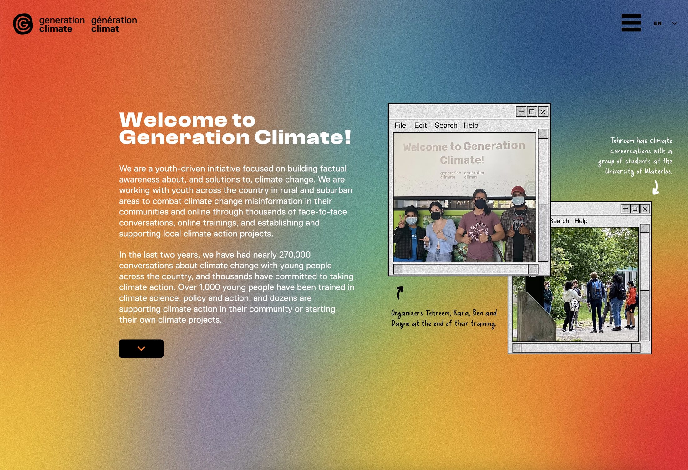
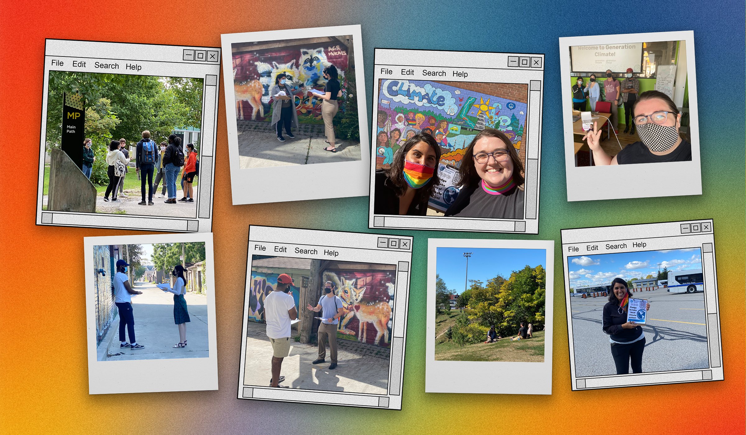
I designed the website as an extension of the identity: the same type, colour and framed photos carried through to layout, navigation and content. Instead of stock imagery, the site and brand materials feature the program’s real people: canvassers, trainees and organizers in real conversations out in their communities, set in the brand’s window and polaroid frames.
What the work supported
These are the initiative’s results; the identity and website were its public face.